Reviewed former pages
Product research and longitudinal benchmarking across a complex enterprise ecosystem—connecting recurring user friction to product priorities, measurable experience gains, and business impact.
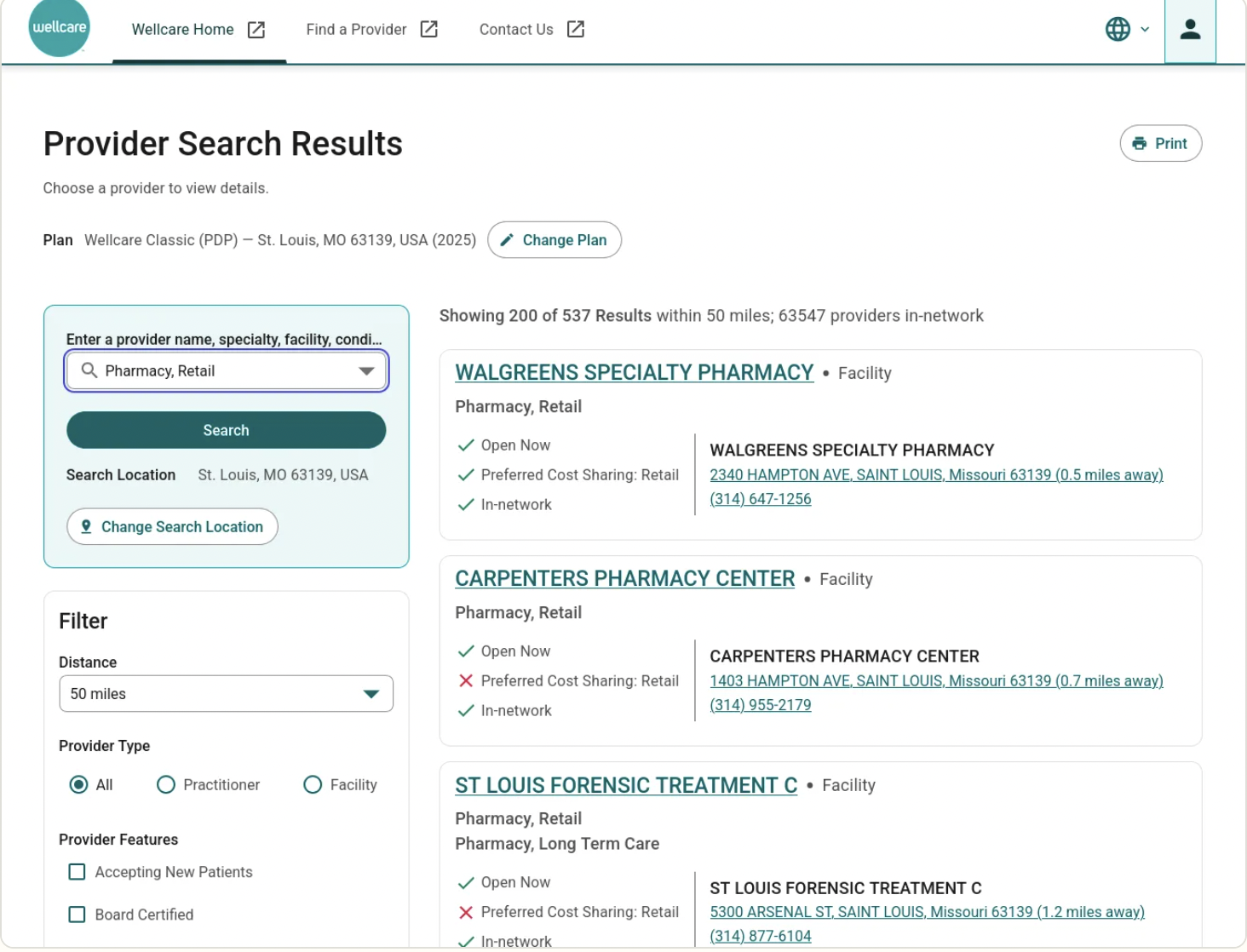
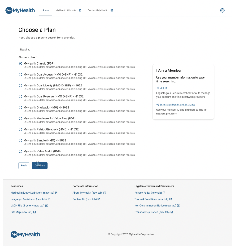
Centene was consolidating fragmented Find a Provider experiences across more than 40 state-specific health plan sites into a unified enterprise experience. The research challenge was not simply whether members could complete a search, but where the experience consistently broke down across lines of business, which issues persisted over time, and which changes would produce measurable improvement.
Regulatory and contractual requirements limited how far some search and provider-information patterns could be changed.
Plan-level descriptions and provider imagery were incomplete or inconsistent.
Accessibility compliance introduced additional design and implementation requirements.
The work had to align with PI planning and Open Enrollment timelines.
Recommendations needed to work across multiple lines of business, including WellCare Medicare and Ambetter Marketplace.
Newer interaction patterns, such as provider comparison, had to be validated without disrupting core search behavior.
“Find the Find a Provider tool.”
“Change the current language from English to Spanish.”
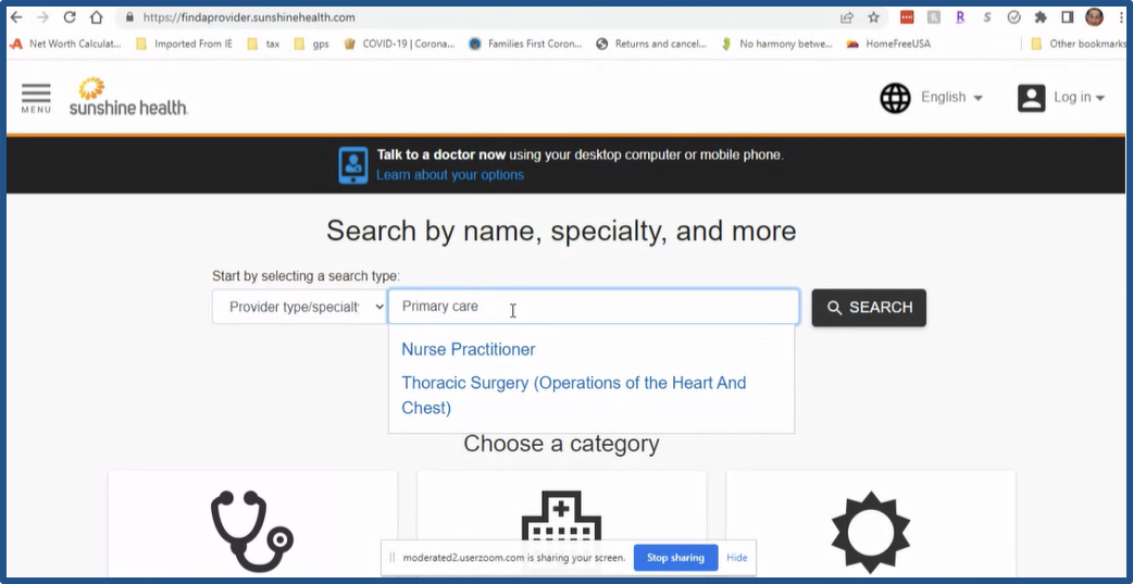
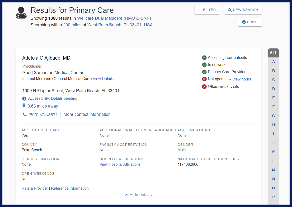
“Find a primary care doctor and let us know if they are open on weekends.”
“Find a female dermatologist that is accepting new patients and speaks Spanish.”
Gathered prior data and competitor analyses to inform discovery and new design prototypes.
Identified competitors for testing.
Facilitated all interviews—15 total, 5 per line of business—and benchmark studies—12 total, 2 per website and 4 per line of business.
Synthesized all data and presented findings to leadership.
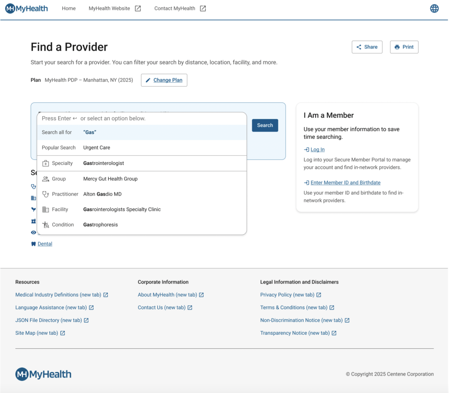
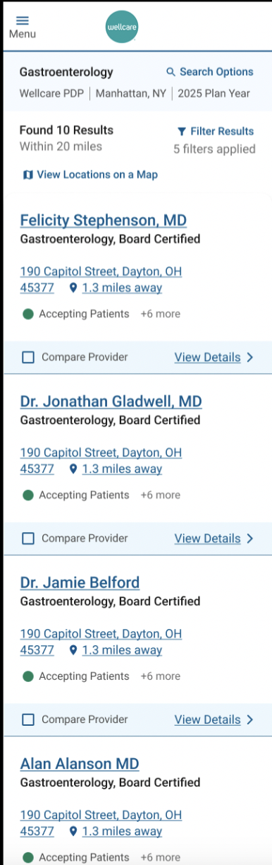
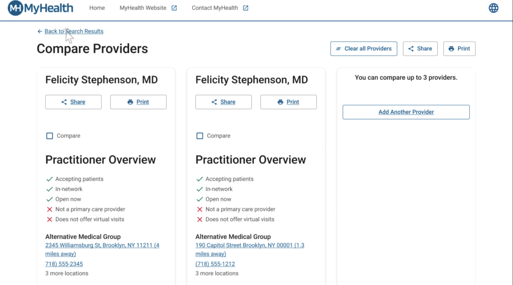
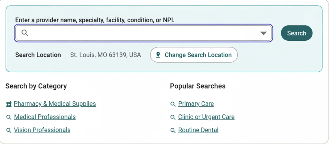
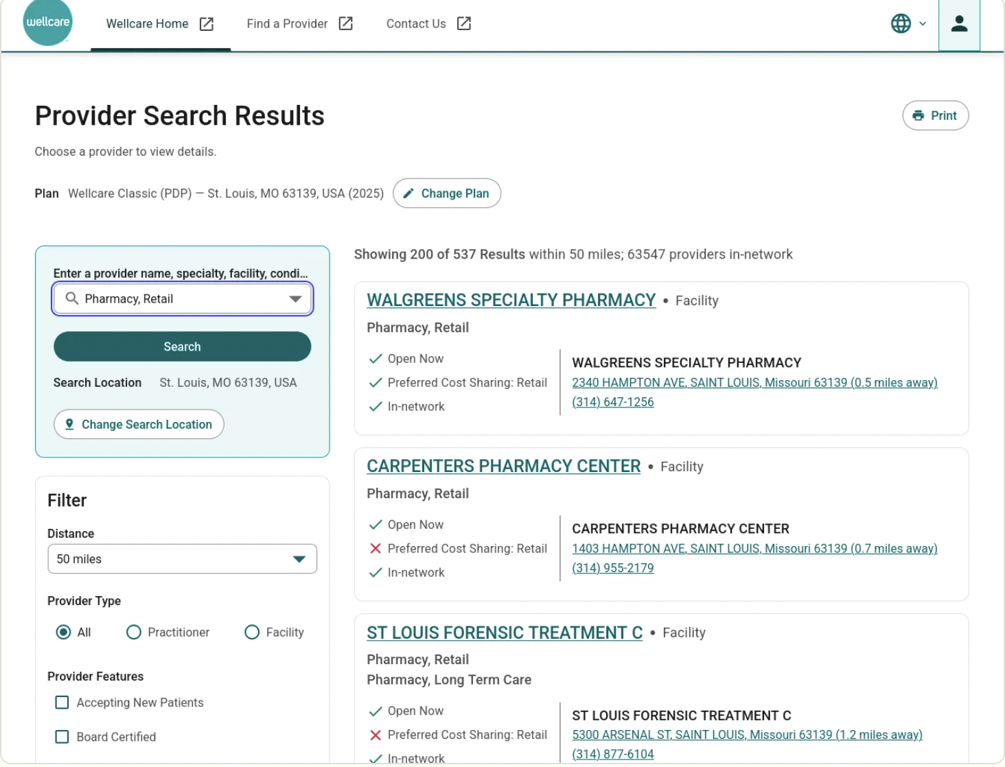
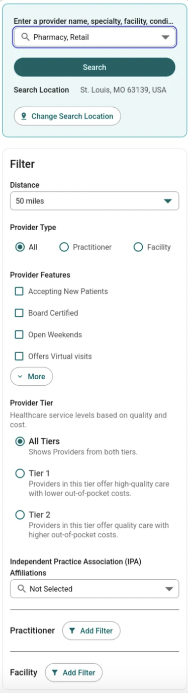
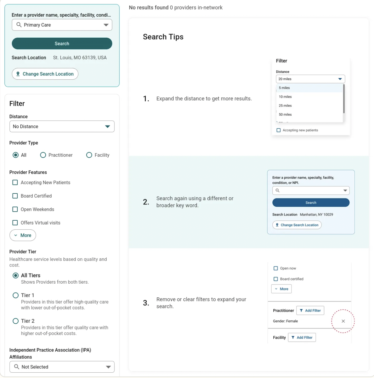
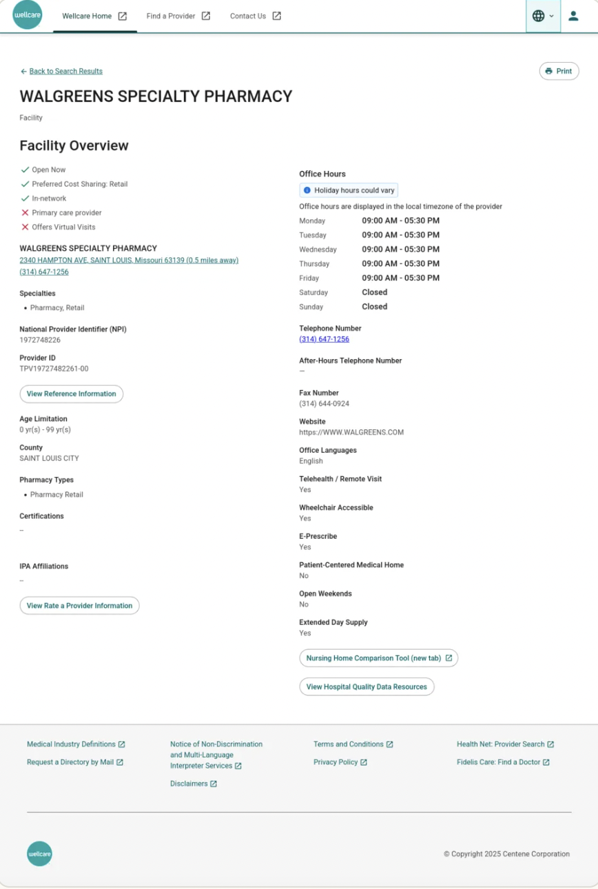
5 deep-dive interviews per line of business exploring prior care-seeking experiences, core screen feedback, and platform preferences.
2 surveys per site tracking Task Ease/Difficulty scales (1–5) with conditional follow-up logic to diagnose user friction.
An 8-question post-test framework combining behavioral task success with attitudinal metrics including trust, loyalty, aesthetics, and ease of use.
Results suggested that users wanted to get to the results faster by having less filtering up front in language that they understood. Users found the results page overwhelming and outdated, preferring profiles to expanding results cards. Users were also confused when seeing places labelled as “providers” on results cards.
Place the “Find a Provider” CTA in multiple layout locations to optimize tool discovery.
Add an explicit, dedicated “Primary Care Doctor” option to the initial category drop-down to compress the search funnel. For example, if someone is searching for a primary care provider, use “Primary Care” rather than “Primary Care Nurse.”
Rename ambiguous “provider” labels to “places” or “doctors” on search cards so users apply filtering choices correctly.
Add provider profiles to improve comprehension, mitigate overwhelm, and inform confident decision-making.
Add clear steps to help redirect users to relevant results.
A single usability study only tells you what's broken today. True UX strategy requires repeated measurement over years to provide evidence that you addressed the user problem.
Documenting moderated sessions in a central, structured table in real-time eliminates synthesis lag, dropping insights into developer hands instantly.
Inviting cross-functional teams directly into research observation rooms builds rapid organizational empathy and aligns competing LOB roadmaps.
A great researcher doesn't let data sit in a silo. By packaging my findings into journey maps and personas and delivering them to our centralized Experience Management Insights team, I helped build foundational enterprise artifacts. This project taught me that true alignment happens when every internal department operates from the exact same baseline knowledge of our members.